On this page
Laying out content in ProSite
Layouts are the building blocks of every ProSite page, controlling how your content is arranged and aligned.
Layouts are the building blocks of every page you create in ProSite. Understanding how they work - and how to nest them - gives you precise control over how your content looks on any device.
What is a layout?
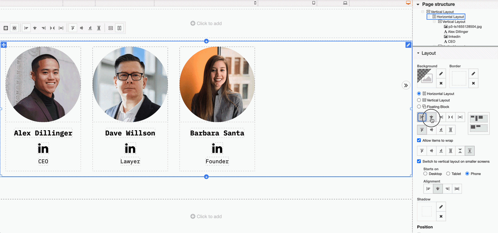
A layout is a block that can contain multiple elements, such as text, images, or other content available in ProSite. Layouts can also contain other layouts, letting you build a nested structure on your page. That nesting is particularly useful for alignment, as explained below.
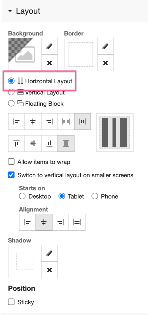
Layout types
There are three layout types.
- Horizontal - aligns child elements side by side, horizontally.
- Vertical - stacks child elements on top of one another, vertically.
- Floating block - lets you position elements anywhere within the layout using drag and drop.
To set the layout type, select the layout and then choose Horizontal, Vertical, or Floating Block from the right-hand menu.
With Floating Block selected, you can drag child elements anywhere within the layout canvas.
Layout alignment
Each layout type supports different alignment options.
Horizontal layouts
In a horizontal layout, content can be aligned along the horizontal axis:
- Left - elements sit at the left edge.
- Centre - elements are centred.
- Right - elements sit at the right edge.
- Space between - elements are pushed to the outer edges, with equal space between them (similar to justified text in a word processor).
- Space around - equal space is placed around every element, distributing them evenly.
Space between and space around are most useful when your layout contains multiple items.
Horizontal layouts also let you set the vertical alignment of the elements they contain:
- Top - elements align to the top of the layout.
- Middle - elements align to the vertical centre.
- Bottom - elements align to the bottom.
- Stretched - elements stretch to fill the full height of the layout, up to its padding. This only applies to elements without a fixed height, such as text or button elements.
Vertical layouts
In a vertical layout, content can be aligned along the horizontal axis:
- Left - elements align to the left edge.
- Middle - elements are centred horizontally.
- Right - elements align to the right edge.
- Stretched - elements stretch left and right to fill the layout width, up to its padding. This only applies to elements without a fixed width, such as text or button elements.
A vertical layout cannot be aligned vertically on its own. If you need to align elements to the top, middle, or bottom of a container, use a horizontal layout, or nest a vertical layout inside a horizontal one.
For example, an About Us section might be a vertical layout (so its contents stack top to bottom), but placed inside a horizontal layout set to middle alignment. This centres the vertical layout against an image in the adjacent column.
Wrapping layout contents
In a horizontal layout, you can enable Allow items to wrap. When this is off, elements will not wrap and may overflow the layout boundary, appearing off canvas. When it is on, elements wrap onto a new line once there is no longer enough horizontal space for them all in a single row.
Wrapping is a practical way to design content that flows well across different screen sizes. On a wide screen, more items fit in a single row. On a narrower screen such as a tablet, fewer items fit and additional rows form automatically.
Switch to vertical on smaller devices
On narrow devices such as mobile phones, content that works well in a horizontal row may be too cramped to read. You can configure a horizontal layout to switch to a vertical layout on smaller devices, and specify which device size triggers the change.