On this page
Understanding spacing options in ProSite
ProSite gives you two types of spacing controls - padding and margin - to help you position and size elements on your pages.
ProSite gives you two types of spacing controls - padding and margin - to help you position and size elements precisely on your pages.
Spacing options
When you click an element, the spacing options appear in the right-hand menu.
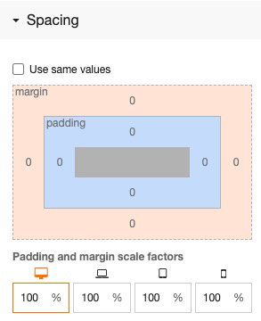
You can adjust spacing uniformly on all sides, or set each side independently. To apply the same value to all sides, tick the Use same values checkbox.
What is the difference between padding and margin?
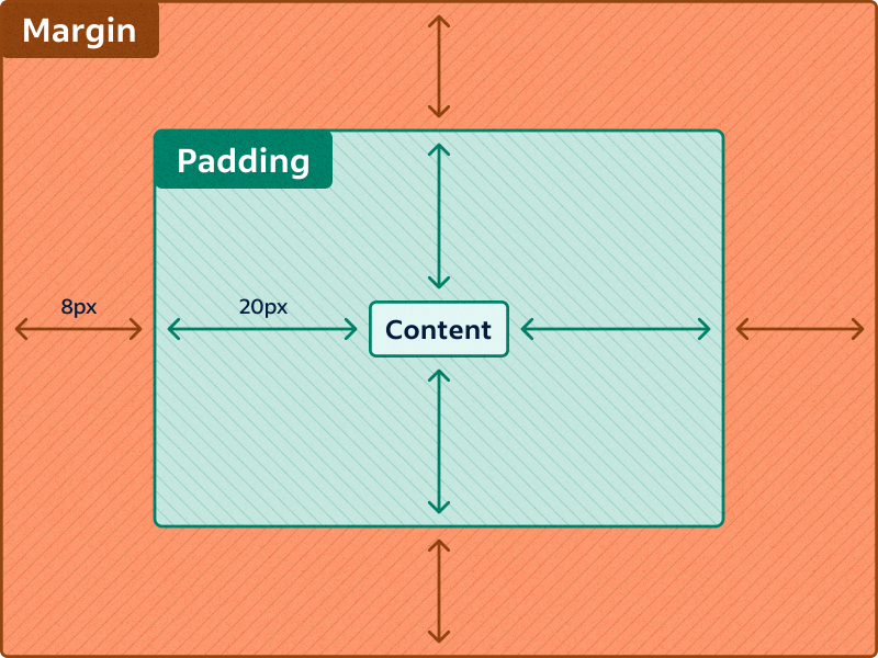
- Padding adds space inside the element, between its content and its border.
- Margin adds space outside the element, pushing it away from neighbouring elements.
Spacing values are measured in pixels (px).
When should I use padding vs margin?
There is no hard rule, but a useful general guide is:
- Elements (text, images) - use margin to control the gap between them, and rarely use padding. Buttons are a notable exception: they almost always need padding to give the label room to breathe.
- Layouts - use padding to control the space between the layout's edge and its contents, and use margin more sparingly.
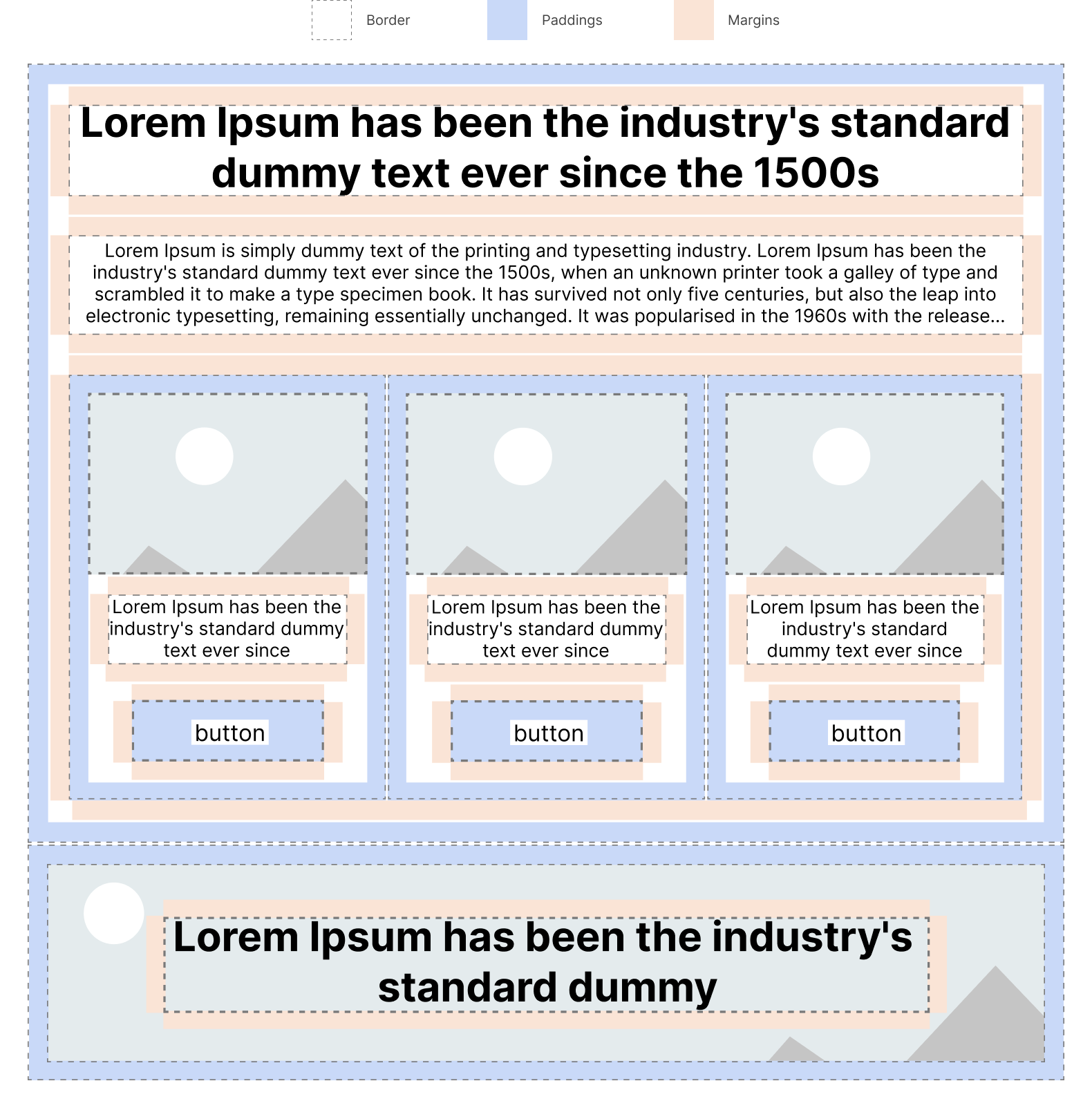
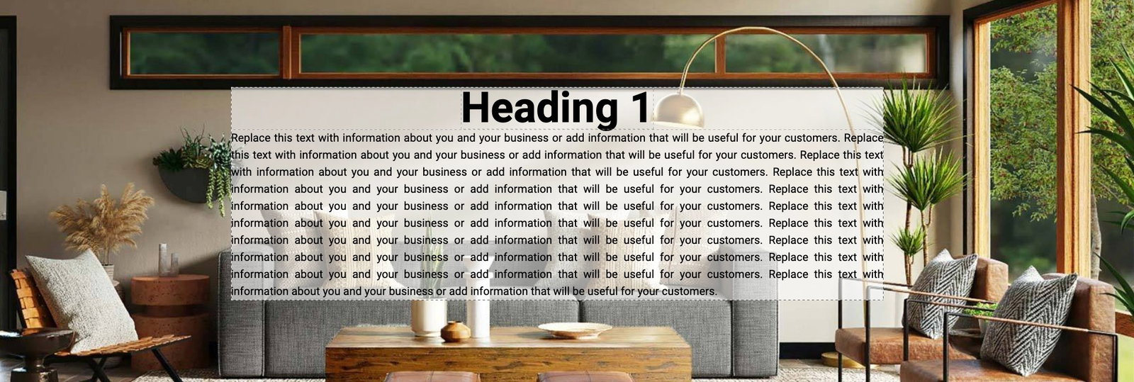
The image below shows a typical page layout with padding and margin applied:
Practical examples
Adding padding to a button
Here is a button with no padding. Because the button has automatic height, the label sits right against its edge.
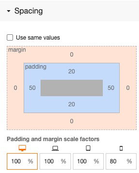
After adding 20px of padding to the top and bottom, and 50px to the left and right, the button looks much more balanced:

Here is how those values appear in the spacing panel:
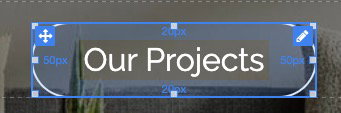
You can also see the padding highlighted in the editor view:
Adding margin between buttons
If you duplicate the button to create a second one, both buttons sit directly alongside each other with no gap:

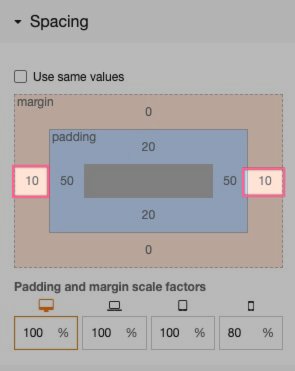
Adding a 10px margin to each button pushes them apart. Because each button contributes 10px, the total gap between them is 20px:

Checking the mobile view
Switching to mobile view reveals a problem. The containing layout is set to stack its children vertically on smaller screens, so the buttons now sit directly on top of each other because no top or bottom margin was set:

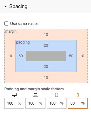
Adding 10px of top and bottom margin fixes this:
The buttons are now nicely spaced on mobile too:

The spacing panel also includes Scale Factors. These let you increase or reduce padding and margin on different device sizes. In the example above, the scale factor is set to 80%, so the padding and margin on mobile are 80% of the desktop values - a useful way to keep things proportional on smaller screens.
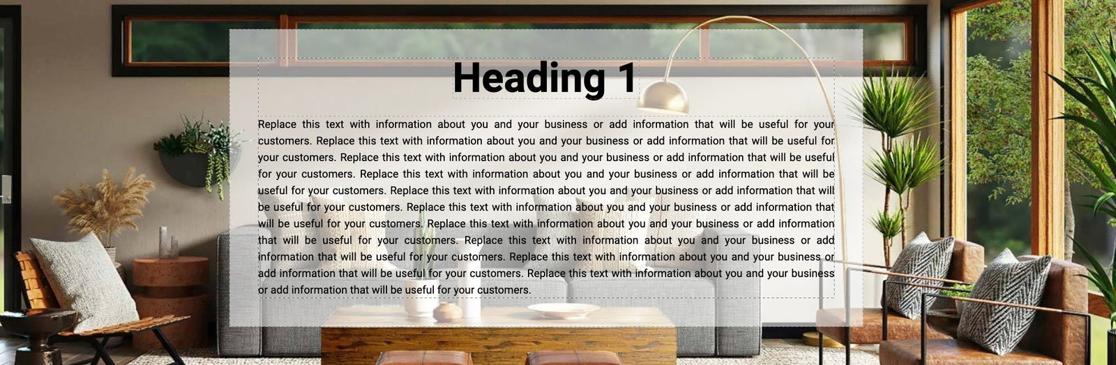
Padding on a layout
In this example, a nested layout has a semi-transparent background containing some text. Without padding, the text fills right to the edge of the layout.
Adding 50px of padding to the layout pushes all the text 50px in from the edge. Adding 30px of bottom margin to the heading creates a clear gap between the heading and the body text: