On this page
How to make your site work on multiple devices (phones, tablets etc.)
ProSite automatically adapts your site for different screen sizes, and gives you fine-grained control over spacing, fonts, and visibility per device.
Your site automatically adjusts for different device types, and you can preview and fine-tune how content looks across desktop, tablet, and mobile right from within the editor.
Check how each new section looks on every device as you build it. Catching layout issues early - before you duplicate a section or replicate a page - is far less work than going back to fix things across many pages at once.
Viewing your site as different devices
Use the device type selectors at the top of the editor to switch between desktop, tablet, and mobile views. The canvas updates immediately to show how your content will appear on each device.
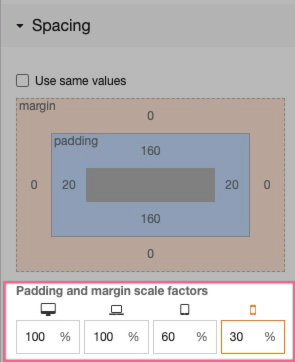
Adjusting padding and margin for different devices
Smaller screens often need tighter spacing. In the spacing menu, you can adjust the scale factor for an element's padding and margin on a per-device basis, or remove spacing altogether for mobile.
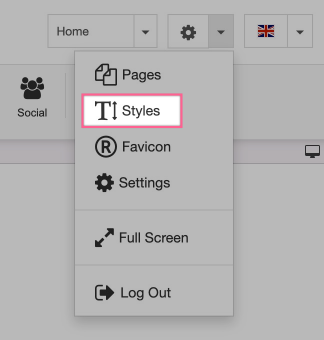
Adjusting font sizes for different devices
Font styles are defined in the Styles tab. Open it from the editor toolbar:
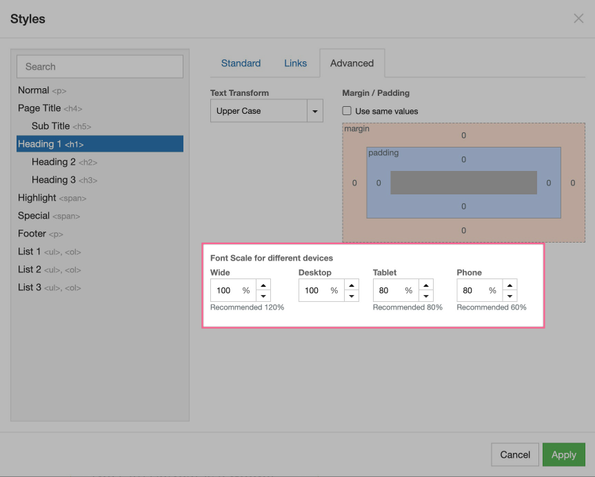
Click the Advanced tab to set a scaling factor per device type. This lets you reduce font sizes on smaller displays without affecting your desktop layout.
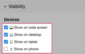
Controlling visibility across different devices
Sometimes you want certain content to appear only on specific device types - for example, a simplified banner on mobile but a fuller version on desktop. You can control this by adjusting the visibility settings for any element and toggling it on or off for each device.