On this page
Creating a sticky navigation menu
A sticky navigation menu stays fixed at the top of the page as visitors scroll, making it easy to navigate content-heavy sites.
A sticky navigation menu - also known as a fixed navigation menu - stays visible at the top of a webpage as the user scrolls down. This is particularly useful for content-heavy sites, as it means visitors never have to scroll back to the top to reach the navigation.
Making your header sticky
-
Log in to cPanel and open the ProSite Site Builder.
-
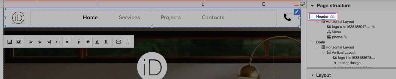
Select the Header element in the page structure tree on the right-hand side. The header is the element that typically contains your navigation menu.
-
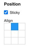
In the Layout options panel on the right, tick the Sticky checkbox. To fix the menu to the top of the viewport, set the alignment to top-centre.
-
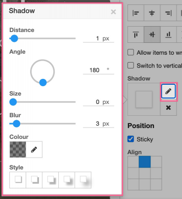
The header will now stick to the top of the page as you scroll. If your header and page body share a similar colour, consider adding a Shadow to the header so the menu remains clearly distinguishable from the content beneath it.
Your sticky navigation menu is now set up.
Creating a left-aligned sticky menu
You can create other sticky menu styles by adjusting the alignment settings. For a left-aligned sidebar-style menu, try the following:
- Set the alignment to top-left.
- Set the menu element and its child elements to use a vertical layout.
- Set the header width to a percentage of the screen - for example, 20%.
This produces a left-aligned sticky menu that sits alongside your page content as visitors scroll.
You may need to adjust other layout settings - such as padding, z-index, or content area width - to ensure the rest of your page content flows correctly alongside a left-aligned sticky menu.